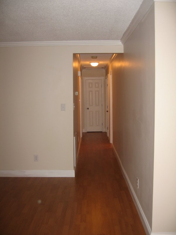
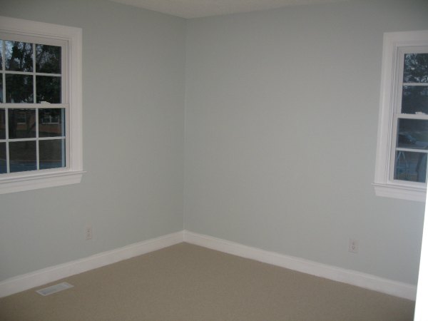
The photos below are ones that I took in 2008 right before we moved in. This is our first home. It's definitely a starter home, and we feel very blessed to have a place to call home.
My goal is to create a more beautiful space for us to live in. My style has definitely changed over the years since we first moved in, but I believe I am beginning to find my true style. In 2008 and newly married, I thought my home had to be like a Rooms to Go showroom where everything matched. I prefer transitional living spaces, but I also love a touch of the unexpected. I am influenced by Scandinavian design, mid century modern, whimsical spaces, industrial design, and some modern minimalist design, but ultimately, I am learning to build a home around the things I love, even if they may not necessarily go together. I want my home to reflect me, not what I think others should feel like my home should be, which is how I first started decorating in 2008. If a room has been updated, I'll include a progress or after photo along with a link (if possible).
To get a better understanding of the styles I love, please check out my Interior Spaces Pinterest Board.
Stats:
Moved in: 2008
Moving out: Possibly the summer of 2016.
Square footage: 1200
Year built: 1973
Style: Single Family Ranch
Own or rent: Own
3 bedrooms, 2 baths
Raleigh, North Carolina
All photos, unless noted with a link, were taken in 2008.
Front of house: (Please note. Matt and I lack green thumbs and an eye for landscaping. This means I doubt we will ever, ever post anything about yard work, gardening, or sprucing up our exterior. It's so sad; I know. :)
Back of the house:
Kitchen:
Progress: (Link)
Laundry || Dining || Part of Living Room:
Dining:
Progress:
Laundry:

Living Room:
Living Room:
Progress: (Link.)
Progress: Read more here.
Hallway looking from Living Room:

Hall Bath:
Owen's Bedroom:
After: (Link here.)
Office:
Progress: (Link here.)
Master Bedroom:
Master Bath:


Yes, I do like your style! The colors, white, calm, simple yet interesting, touch of yellow, chevrons -- yep, that's where I want to go with my redo (when and if, that is)! Thanks, I'll be watching.
ReplyDeleteI love it - what a great house. My favorite are the chevron curtains!!
ReplyDeleteYou have done an awesome job with your house! Love the chevrons! And the white. And the dark grey. And...
ReplyDeleteThank you!
DeleteLOVE the look of your dining room walls! What paint did you use?
ReplyDeleteCement Gray by Martha Stewart
DeleteSo in love with your style and the progress you're making! I also love that you're focusing on finding your own style!
ReplyDeleteWhat is the blue color in living room? We have twin houses! So inspired by yours! Refreshing to see a normal home!
ReplyDeleteI love your style! Can you tell me what type of window treatment you used on the french doors in your kitchen? Thanks!
ReplyDelete